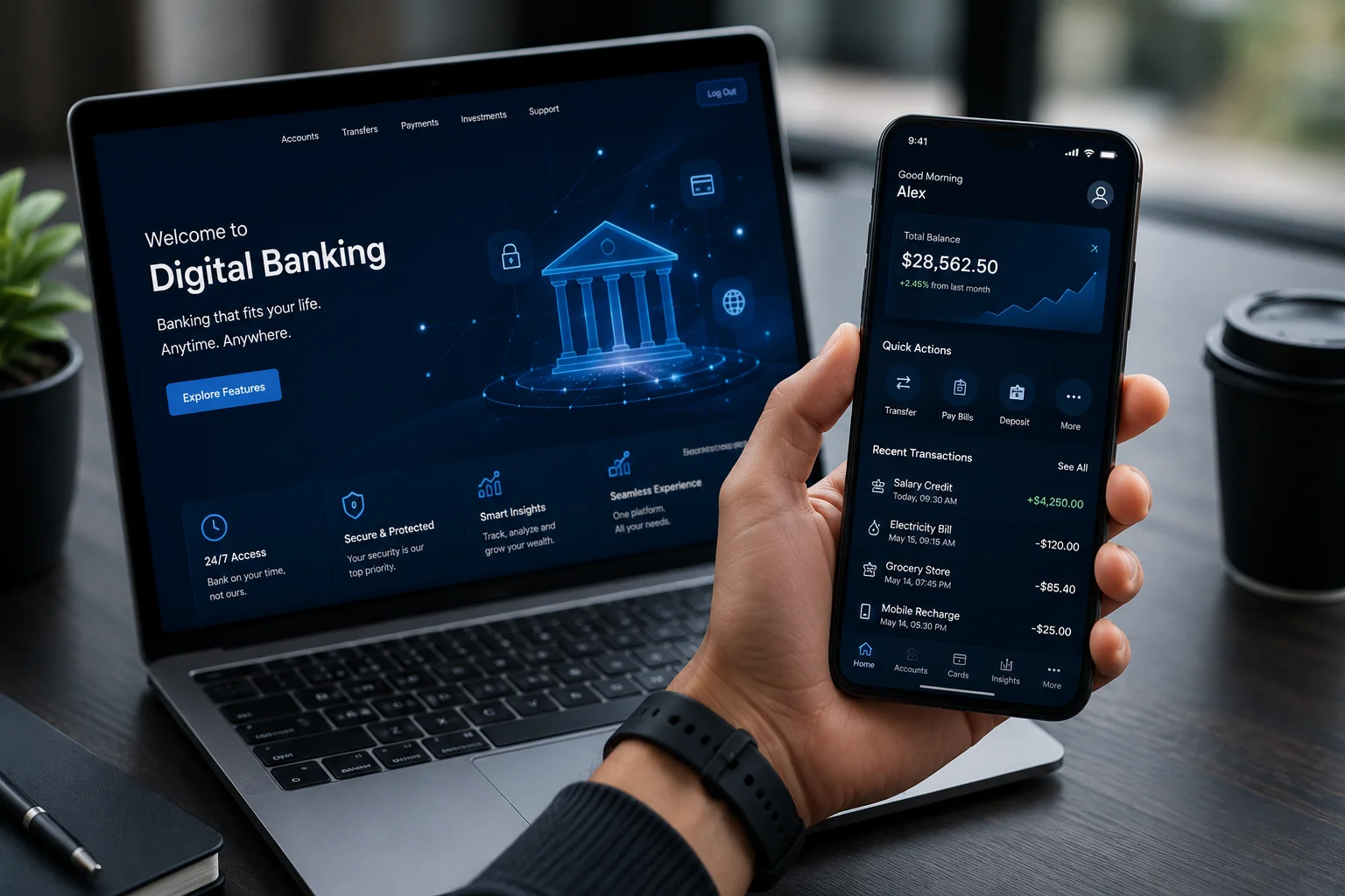
Open most banking apps today and you’ll notice a familiar pattern: your account balance at the top and a long list of transactions below.
It works. But it doesn’t always help people understand their money.
Over the past few years, fintech products have started to rethink this experience. Instead of treating banking as a simple record of transactions, they treat it as a tool that helps people make better financial decisions.
The difference is not just technology, it’s design.
By focusing on clarity, speed and real user behavior, fintech apps have quietly set up a new benchmark for what digital banking should feel like. There is a lot to learn from how these experiences are designed.
Here are five UX lessons worth paying attention to.
1. Don’t Just Show Data - Help Users Understand It
Ever opened your banking app, looked at your balance, and still wondered where all your money went? Many banking apps still function like digital statements. They show balances, deposits, withdrawals, and transactions, but they don’t always help users understand their spending habits.
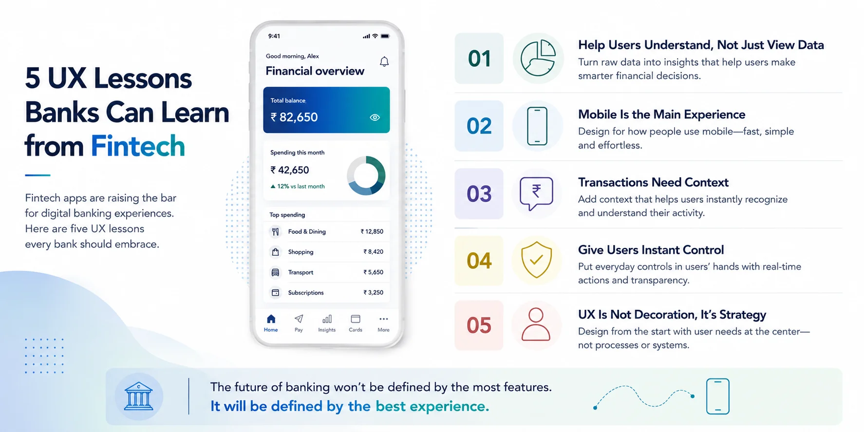
Fintech products take a different approach. Instead of simply displaying information, they help users interpret it. Spending categories, visual summaries, and monthly insights make it easier to understand where money is going. User will be more interested in seeing:
- How much they spent on food or subscriptions this month
- Whether their spending increased compared to last month
- If they’re close to reaching a budget limit
These small design decisions turn a banking app from a passive record into something more useful.
2. Mobile Isn’t a Smaller Screen, It’s the Main Experience
How many times have you opened a banking app while standing in a queue, only to spend several taps searching for a simple feature?
For many people today, smartphones are their primary connection to the bank. Yet a lot of banking apps still feel like desktop systems squeezed into a mobile screen. Navigation becomes complex with everyday actions requiring too many steps, and priority features often buried inside menus.
Fintech products usually start with a this understanding that the mobile app is the main interface. That mindset changes how things are designed, like
- Interfaces built for thumb navigation
- Fewer steps for everyday tasks like transfers
- Clear spacing and visual hierarchy
- Faster interactions with minimal friction
Designing for mobile phones also means understanding how people actually use their phones. Most interactions happen quickly and often on the move. Users might be checking their balance while commuting, paying for something in a store, or quickly transferring money between accounts right before a payment requirement. When the interface is designed for these real-life moments, the experience feels fast, responsive, and effortless.
When sending money or checking spending becomes effortless, the experience starts to feel natural rather than procedural.
3. Transactions Need Context
A plain transaction list often leaves users guessing. A transaction entry such as “POS Transaction of ₹1,700” does not tell much of a story. Was it a restaurant bill? A grocery purchase? An Online subscription?
Fintech apps improve this by adding context around each transaction. Merchant logos, spending categories, location details, and notes help users instantly recognize what the payment was for.
Banking context also help reduce the cognitive effort of the user required to understand financial activity. When users can quickly identify where their money went without having to recall or investigate each transaction, the experience becomes smoother and more
intuitive. Small visual cues like icons, categories, or merchant names make the information instantly recognizable.
Banking context also help reduce the cognitive effort of the user required to understand financial activity. When users can quickly identify where their money went without having to recall or investigate each transaction, the experience becomes smoother and more
intuitive. Small visual cues like icons, categories, or merchant names make the information instantly recognizable.
That small shift makes financial activity easier to understand at a glance
4.Give users Instant Control
Lost your card while traveling? Would you rather call customer support and wait on hold or freeze the card instantly with a single tap? One of the biggest strengths of fintech products is the level of control they put directly in users’ hands.
Actions that once required calling customer support or visiting a branch can now be completed instantly through the app, including:
- Freezing or unfreezing a card
- Creating virtual cards for online payments
- Setting spending limits
- Receiving real-time transaction alerts
These features do not just improve convenience. They are also also responsible for building trust when users feel they can control their finances instantly. The user’s banking experience can eventually become far less stressful and easy to navigate.
Another important aspect of instant control is transparency. When users can see exactly what is happening with their money in real time, they feel more confident using digital banking services. Small UX decisions like instant notifications, clear confirmation messages, or simple toggles for enabling and disabling features reduce uncertainty and help users stay aware of their financial activity without extra effort.
From a UX professional’s perspective, it is about replacing the waiting service with immediate action.
5. UX Is Not Decoration, It’s Strategy
Have you ever wondered why some banking apps feel effortless while others make even simple tasks frustrating? The difference often is not only about the quantity of features, but also how the product is designed and approached from the start.
Fintech teams like that of i-exceed treat user experience as part of their product strategy. Design decisions are made around reducing friction and making financial tasks easier to understand.
In many Fintech products, User Experience is involved from the beginning of the product development process. Instead of banks asking, “How do we fit this feature into the app?” banking software providers must ask, “How will users experience this feature?” That small shift in thinking can have a huge impact on the final product.
In contrast, many traditional banking apps are still shaped by internal systems, operational processes, and organizational structures rather than customer needs. Features are often organized around how the bank operates rather than how customers think and behave. As a result, users may need to navigate multiple screens or understand banking terminology just to complete simple tasks.
When product design starts from the user’s perspective rather than the organization’s structure, the entire experience becomes simpler and more intuitive. The goal is not just to make products look better, but to make them easier to understand, easier to trust, and easier to use.
Conclusion
Banking experience used to be designed primarily to get the job done with focus only on compliance and security. Today, users expect more engagement and experiences that help them understand, manage, and control their money.
Fintech companies have shown that thoughtful UX design can completely change how people interact with financial services. Clear interfaces, contextual information, and real-time controls turn everyday banking into a smoother and more empowering experience.
For traditional banks looking to improve their digital platforms, the opportunity is not just about adding new AI or new offerings. It is also about rethinking the experience and moving beyond the transaction list.
The future of digital banking will not be defined by who offers the most features. It will be defined by who creates the simplest, most intuitive, and most helpful financial experiences.
To know more about how i-exceed can help with your digital banking initiatives, get in touch with us at marketing@i-exceed.com .